Brief
MIRROR is a large retail store with over 400 stores worldwide. They have yet to launch online and find that they are missing out on further sales via online shopping.
The time has come for their online debut. MIRROR requests that their site and branding are clean, efficient, and provides a seamless online shopping experience.
Challenge
MIRROR is a fictional company. Which meant that there are no client base to communicate needs with, no real data from business perspective, and no basis on branding. All we know is that they are a competitive retail store who had a gist of what they wanted.
Objectives
With the brief and challenge in mind, I started my 3-week journey with the design process of understanding the user base needs, conducting research, brand development, and a comprehensive prototype of the website.
The Research
Market Research & Competitive Analysis
Leading retailers in the field like ZARA, Mango, Uniqlo, HM, and Madewell’s websites:
The use of white space is common to showcase clothing items.
Branding is unique but minimal.
Websites focus on imagery and brand-specific product photography.
Strong search function.
Comprehensive category field.
User Interviews
To immerse into the user mindset while shopping, I interviewed 4 of my peers from mid 20’s - late 30’s.
5 Questions were asked:
Why do you shop online vs in person?
What do you enjoy about online shopping for clothing?
What do you find most challenging about shopping online for clothing?
What is your favorite online store and why?
How do you discover new retailers?
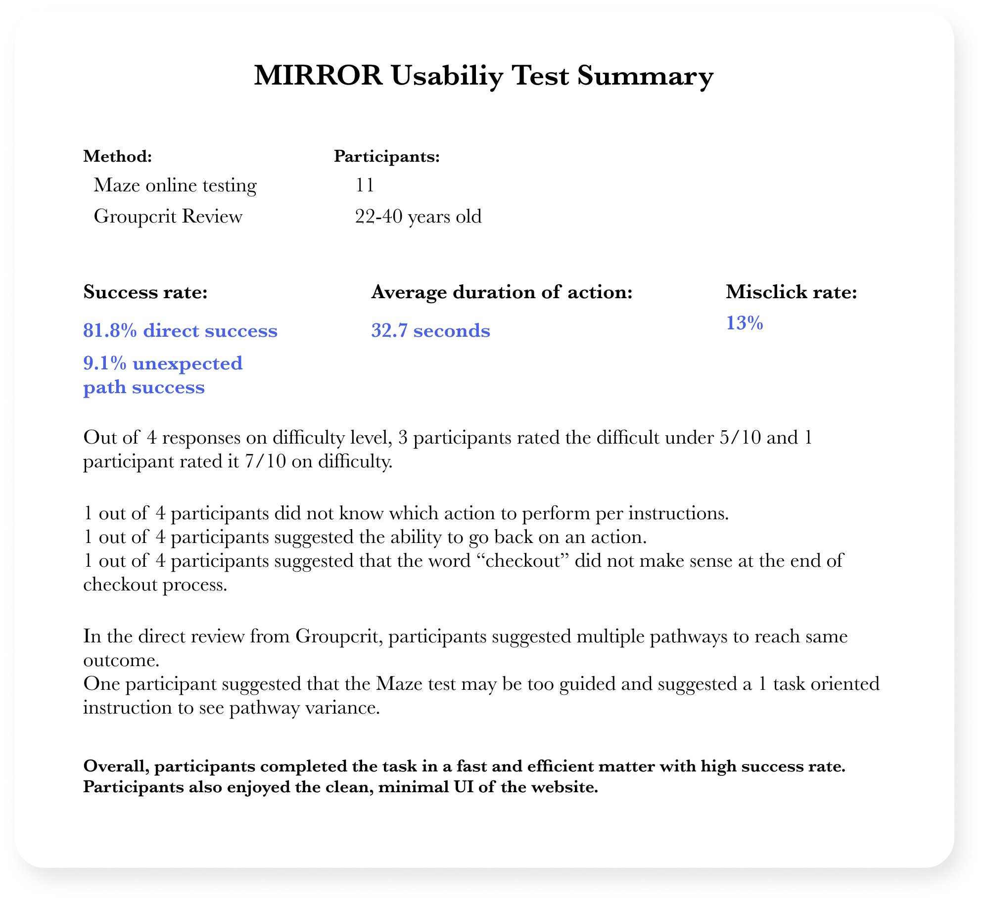
Usability Test
Once I built the prototype of checking out a product, I recruited 11 participants to test the usability.
I also did a live review with 14 of my peers.
Overall, participants completed the task in a fast and efficient manner with a high success rate. Participants also enjoyed the clean, minimal UI of the website.
With the feedback received, a final prototype was designed.

I conducted 4 interviews (2 female, 2 male) within target age range of 20-35.
Gains:
Convenient shopping from anywhere
Free/Fast shipping
Endless options
Pains:
Sizing inaccuracy
Unreliable shipping and return
Hidden or extra charges
-
“The most annoying part of online shopping is the sizing and quality inaccuracy”
The no.1 complaint about online shipping was the lack of accuracy.
-
"Some websites are hard to navigate through because it's too stylistic. I don't want to waste my time, if I had a lot of time, I would just shop in store."
While branding is important, online shopping needs to meet the important criteria of being intuitive and efficient.
Persona

Key solutions:
Sizing accuracy and in-depth review section
Comprehensive product page
Easy and efficient checkout page
The Blueprint

I created a user flow consisting of 3 pathways to reach one product page to ensure user-friendly navigation.

Wireframes


Sample Pages


Pain point solution:
To address the pain of inaccuracy, I created a comprehensive product page that includes clear sizing availability, a size guide, and a complex customer review tool that covers comfort, quality, and fit.
The Aesthetics
“We want clean, minimal, and modern”


Usability test of Prototype
Is it intuitive, easy, and seamless?
A prototype of the product checkout process was created and tested by 11 participants and peer-reviewed by 14. Based on the feedback, the following features were added.
Updates to prototype:
multiple pathways to the product page
update verbiage in checkout stages
add the ability to return in the checkout process (the number of stages was utilized to toggle in between pages).
Lessons Learned and Next Steps

Simplicity is best when it comes to large retail stores because the product information is most important.
Customer reviews are necessary.
Customer sizing and accuracy measurement reviews are happy pills.
Next steps:
Refine the verbiage and buttons per usability test feedback.
Explore more options like videos in the product info.
More branding exploration, brand-specific features and look.
Explore height, weight, and size bought in the user review section, self-reported by users.
Final Prototype